Hello Internet,
When I created the blog and looked at the available themes I wasn’t particularly pleased… In the end, I decided to use the hugo-dusk-theme, which was closest to what I wanted to have.
With time the itch to write my own, more fitting theme, grew bigger and bigger. And, as you might see, I finally scratched that itch. One thing I’d like to emphasize is the now existing Favicon, my first Pixel-Art.
Even though I made my own theme I’m still not completely satisfied. I’m not the greatest Front-End-Engineer and Design isn’t really part of my Skillset, so I guess it won’t get much better than this. Plus, to be honest, I only checked the rendering with Firefox, so I hope the Webpage isn’t broken in other Browsers…
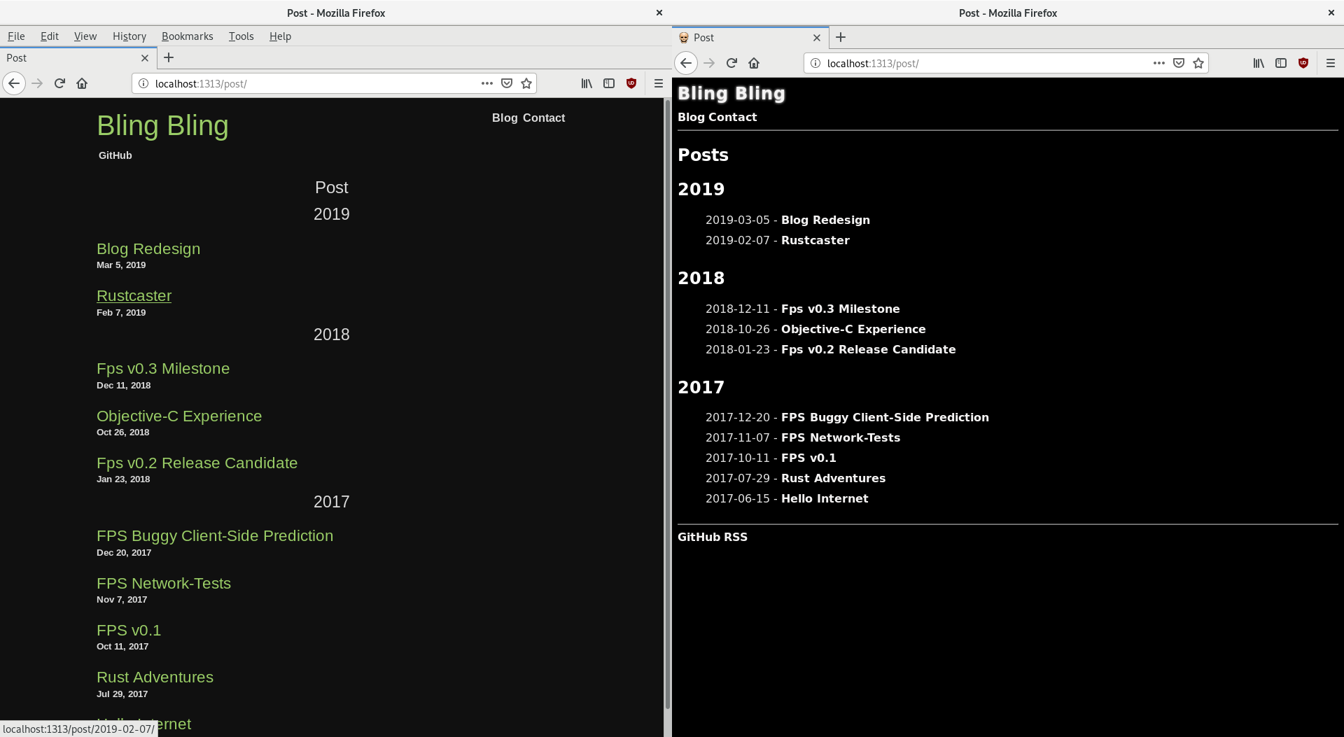
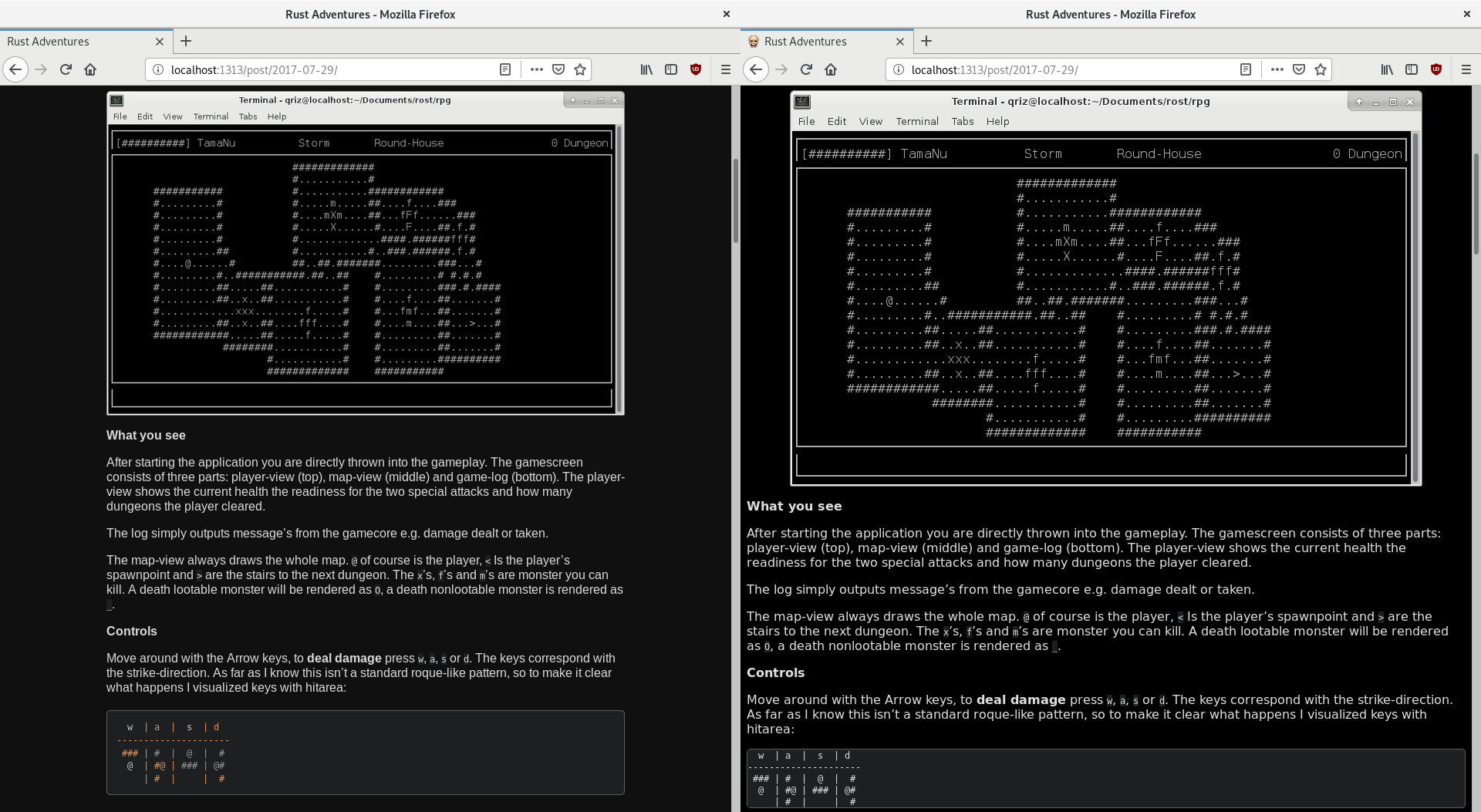
But for now I’m satisfied and to say goodbye to the old design I attached some before/after screenshots:


Cheers,
qriz